
Beverage Union
services:
branding
inspiration:
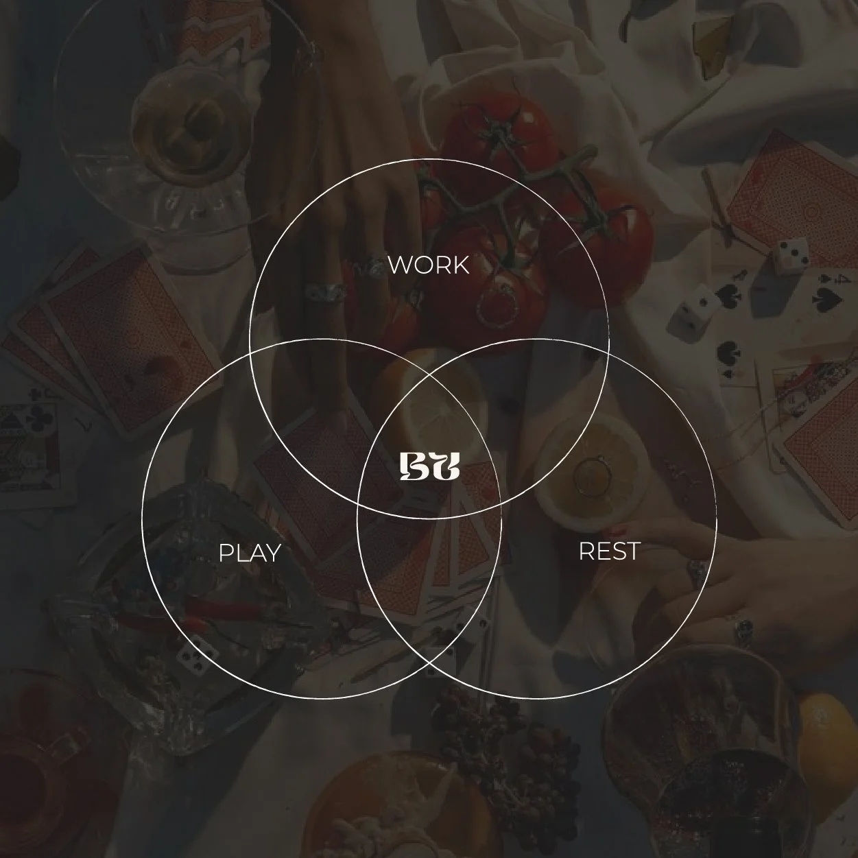
scientific charts and graphs, psychedelic graphics, sacred geometry
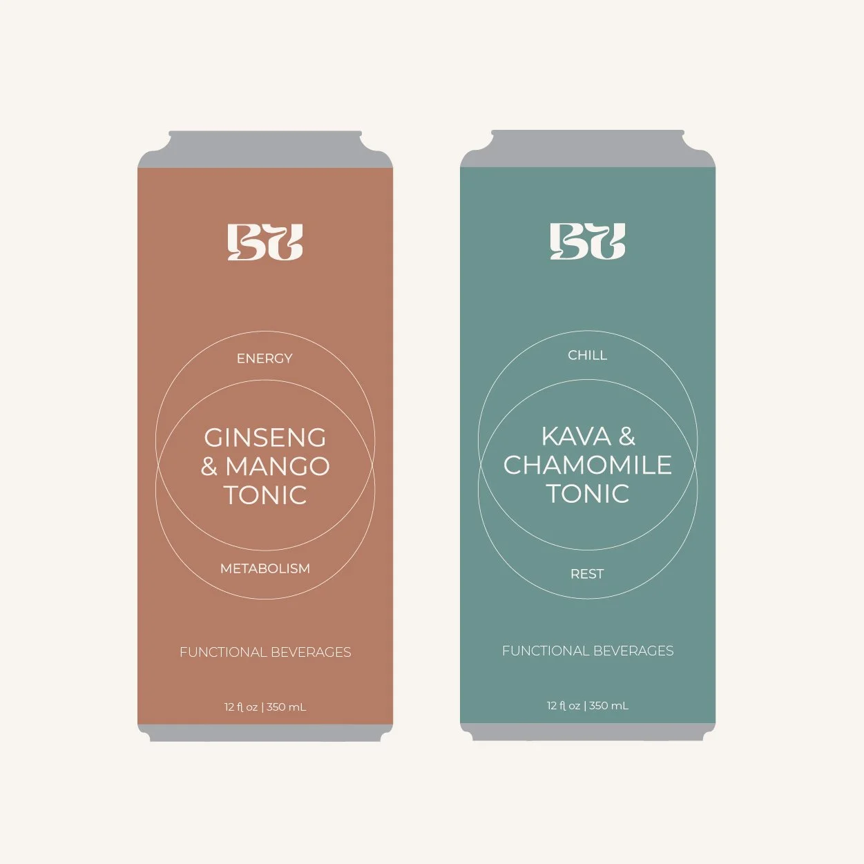
beverage union approached me at a moment they needed a brand refresh. after existing as a b2b coffee company for nearly a decade, they were expanding into the rtd functional beverage space.
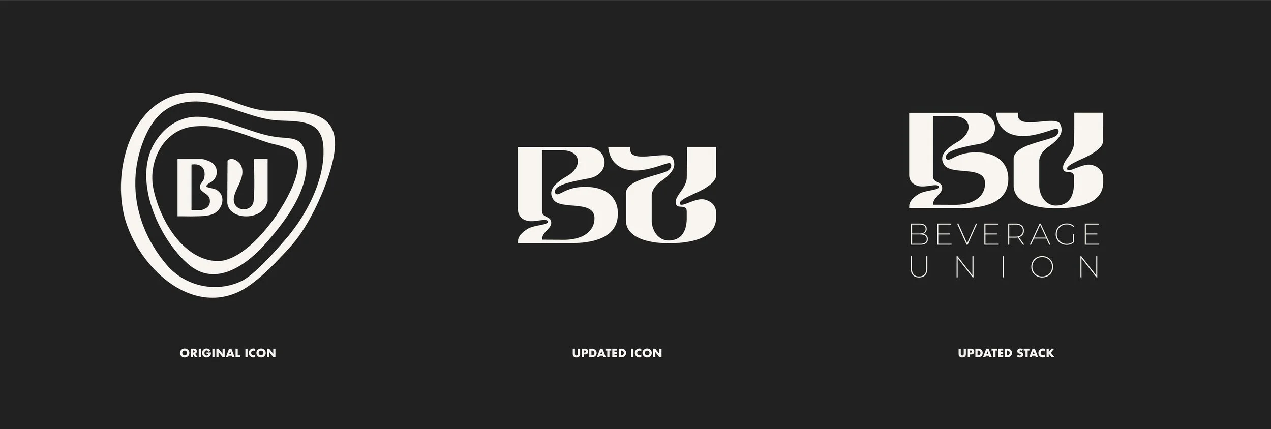
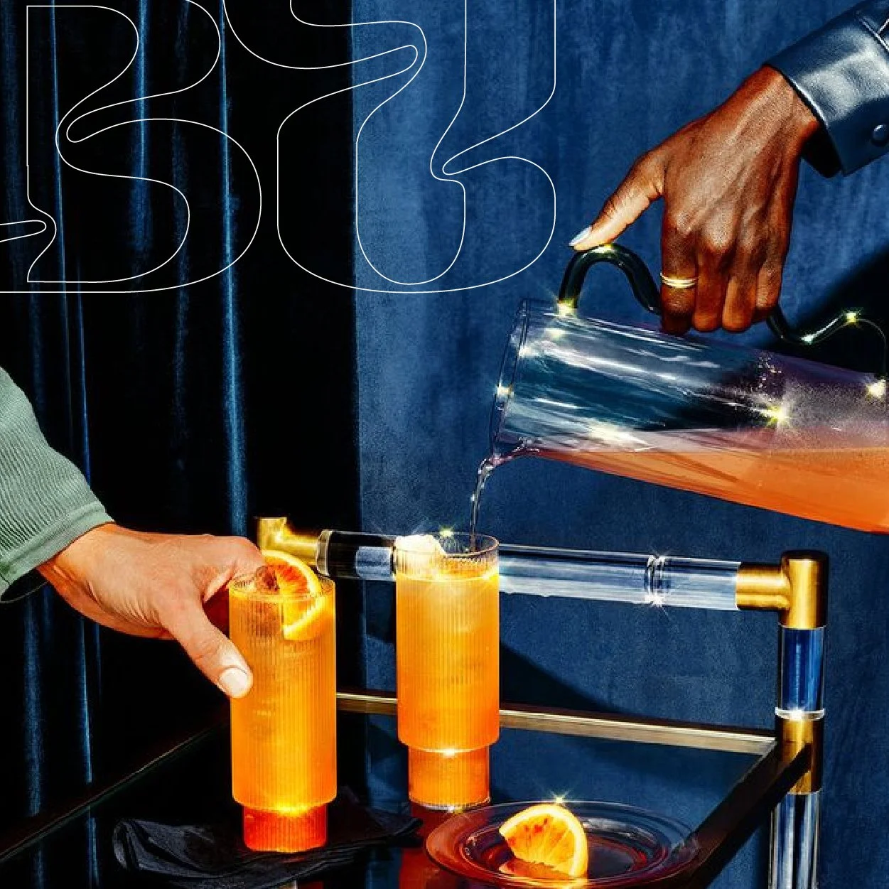
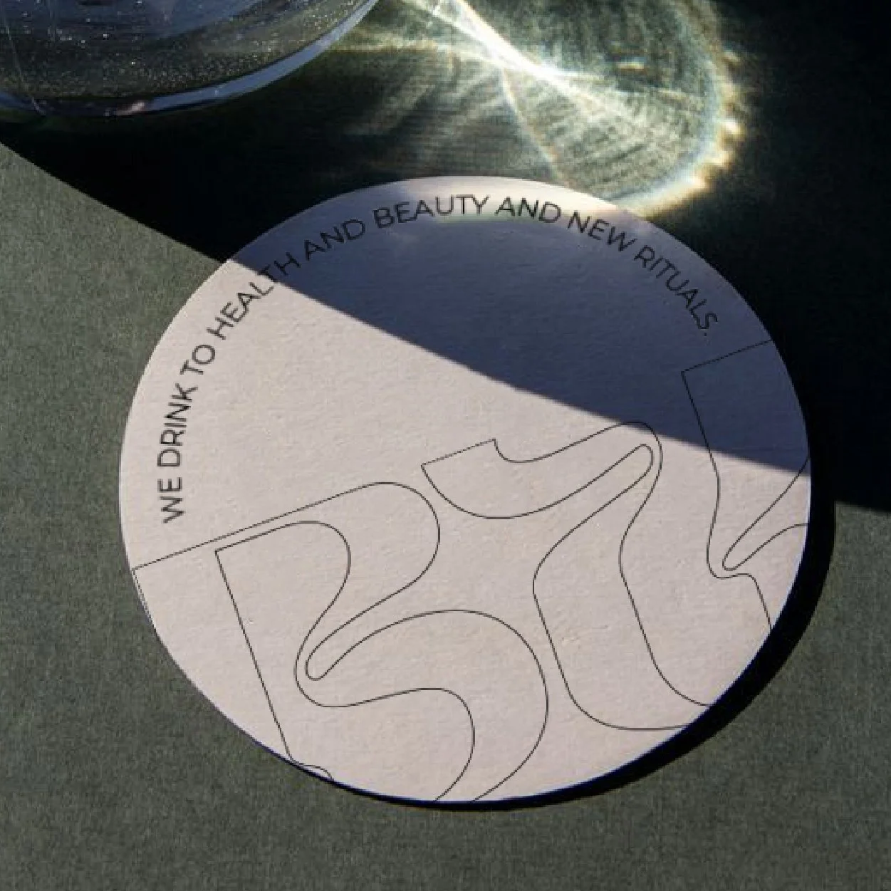
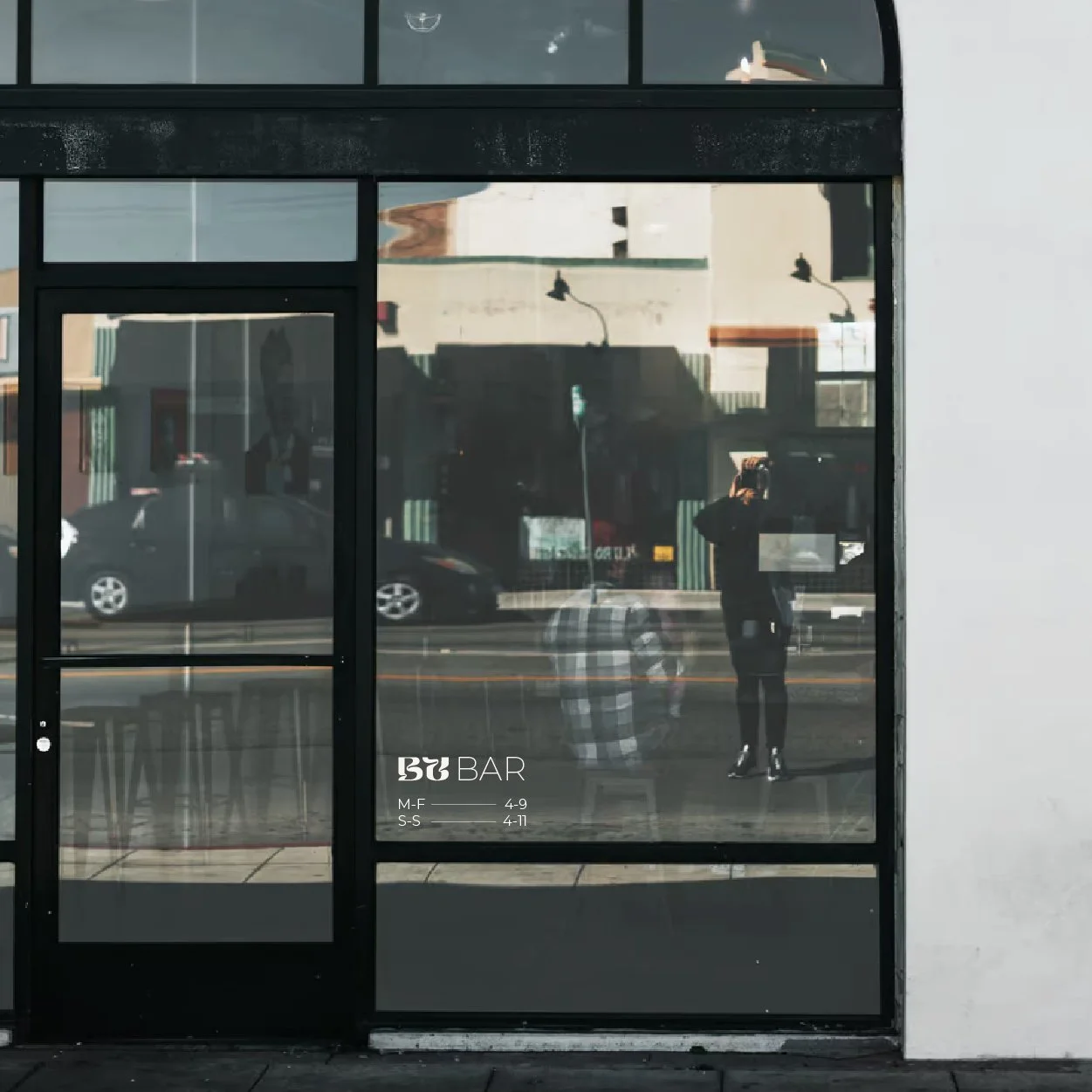
Their “BU” logo had become icon amongst their customers. we gave the icon a refresh, created a modular system for use across all legs of the business, and developed a visual language merging science with aesthetics to help communicate the functional beverages to a new audience.